10 September 2026
Why HappySession was underestimating the swell at Goulien (Crozon peninsula)
A bug found while surfing, Crozon peninsula, early September 2026
A few days of sessions on the Crozon peninsula where the app kept announcing smaller waves than what we actually found in the water at Goulien. The story of the check that followed, and what it changed in the engine.
Early September, a few days of sessions on the Crozon peninsula, between Goulien and La Palue. At Goulien in particular, the same gap kept coming back session after session: the app announced hip- or belly-high waves, we found chest-high sets in the water, sometimes bigger. Not enough to miss a session — but consistent enough not to be a coincidence.
Rather than let it slide, I went back through each session with the real weather-model data behind the estimate, to understand where the gap was coming from. What was meant to be a quick check ended up uncovering a real calculation bug, more interesting — and more stubborn — than expected, plus an angle the engine already handled, but whose calibration was still lacking.
A wind shelter, specific to each spot
That calibration point, precisely: some spots are protected from wind by the local terrain, independently of their exposure to swell. At Goulien, the Pointe de Dinan shelters part of the spot from southwesterly winds — a wind that, elsewhere on the coast, would clearly mess up the water surface, but stays largely filtered here. The calibration was too rough to properly tell the genuinely sheltered sectors apart from the rest. The rules specific to this spot have been tuned for these local wind effects.
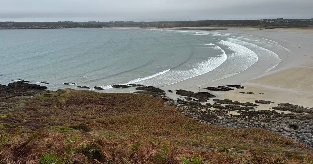
This photo was taken on a day with a moderate southwesterly wind according to the model — the kind of wind that, on an exposed spot, would translate into a choppy surface. Here, nothing of the sort: the bay stays fairly clean, the swell lines wrap in nicely. That's exactly what the attenuation table is meant to capture: a southwesterly wind doesn't degrade the water surface at Goulien, because the Pointe de Dinan cuts its effect.
One swell, or several stacked on top of each other
A body of water almost never has just one swell: there's usually a primary groundswell and one or two others. The engine was already adding them up correctly for the total height. The real problem was that it then applied the same exposure setting to all of them, based on an average direction — whereas at Goulien, two comparable swells often arrive 25 to 40° apart, one much better exposed than the other. Result: a well-oriented swell could end up drowned out by a less favorable average. The fix now applies this setting swell by swell, before recombining them — on the session detailed further down, the estimated height went from 0.4 m to 0.7 m with the exact same raw data.
See the technical detail
An ocean model doesn't first see three distinct waves: what it actually computes is a spectrum — how the sea's energy spreads across every possible period and direction, a bit like a complex sound breaking down into several frequencies. To make that spectrum readable, the model then spots where the energy concentrates, and pulls out a handful of well-identified "swells" — each with its own height, period, and direction. That handful of components is what HappySession receives as input.
Recombining these components into a total height isn't a simple addition. A wave's energy grows with the square of its height: a wave twice as tall carries four times more energy. Combining several swells therefore means adding up their energies, then converting back to a height — which gives, mathematically, a quadratic sum (the square root of the sum of squares) rather than a direct addition. That's exactly how the weather model (WAVEWATCH III, developed by NOAA) already computes total height from its components.
The real problem was elsewhere: direction. The model only gives a single direction for the total swell, a kind of average of the spectrum. On days when every swell arrives from roughly the same place, that average is good enough. But at Goulien, it regularly happens that two comparably sized swells arrive 25 to 40° apart. The engine was then applying a single exposure factor, computed on that average direction, to the entire already-combined height — ignoring that a good chunk of that energy was in fact much better exposed than the average suggested.
The quadratic sum itself didn't need to change, it was already correct. What needed to move is the point where the direction factor kicks in: instead of applying it once, after the fact, to the total height, the fix applies it to each swell individually — each with its own exposure — and only then recombines them, with that same quadratic sum but on heights already adjusted to their real exposure.
One session, before and after
The clearest way to show this is to replay a real time slot with both versions of the engine. Same session, Thursday September 3rd, 7pm at Goulien:
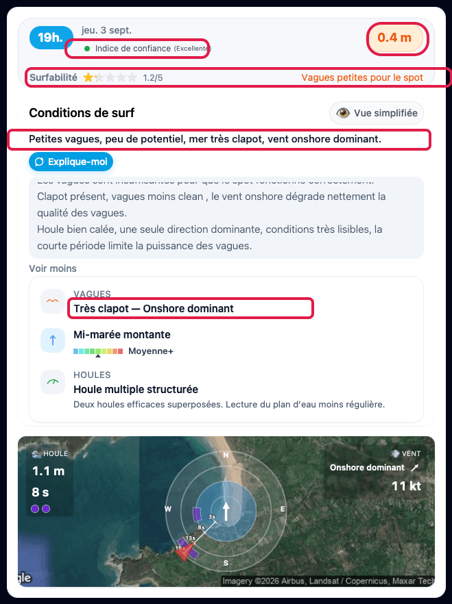
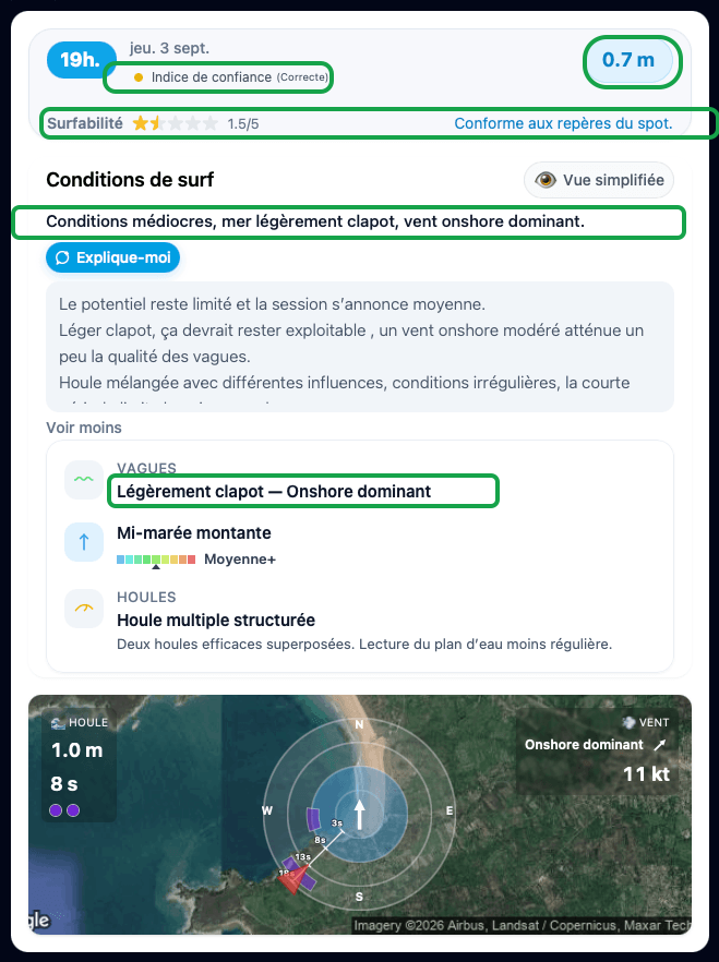
(Both screenshots are from the French version of the app — HappySession's UI, same data either way.)
Four things change, all visible on these two captures:
Local wind is now factored into how the water surface is read. The model sees an 11 kt onshore wind (≈20 km/h) — enough to chop up any exposed spot. But at Goulien, this wind comes from the southwest sector, the one the Pointe de Dinan partly filters (see the photo above: a nearly flat surface despite a moderate wind in the model). Before, the engine ignored this terrain effect and judged the sea "very choppy"; with the local attenuation table, it becomes "slightly choppy" — and the wind text follows suit, from "clearly degrades" to "slightly reduces".
Wave height is revised upward: 0.4 m → 0.7 m. This is the direct effect of the per-component recombination described above, reinforced by the wind shelter easing the chop penalty on this session — both fixes stack.
The plain-language summary becomes more accurate, in both directions. "Small waves, not much potential, very choppy sea" becomes "Mediocre conditions, slightly choppy sea" — more encouraging, without overselling the session either: surfability only moves from 1.2/5 to 1.5/5, still modest.
The confidence rating, meanwhile, goes down: from "Excellent" to "Fair". It's the only number that gets worse, and that's deliberate. This session combines a short-period dominant swell (around 8 s) with a second, much longer component (16 s, barely 0.14 m) arriving from a different angle. Taken alone, either would be easy to read; combined, their real effect on the water surface is harder to guarantee. The old calibration rated any well-oriented swell "Excellent", without checking whether a second one was layered on top. The new one tells the two cases apart: a single, clean swell stays "Excellent"; two efficient swells stacked together now fall to "Fair" — a more honest estimate of what it can actually guarantee.
A radar that didn't count the same way as the text
While comparing an app screenshot with a photo taken at the same moment on the beach, one last detail had come up, more of a footnote but a telling one: the little swell radar could show fewer dots than what the text right above it announced. Neither was wrong — they were simply answering two different questions, without that ever being stated anywhere.
The text counts the swells that are well-oriented for the spot, whatever their size. The radar, on the other hand, only displayed swells whose raw height was above a certain visual threshold — originally meant to avoid cluttering the drawing with imperceptible lines. For this same September 3rd, 7pm session, the model's data was:
| Swell | Height | Period | Direction | Sector | Exposure factor | Efficient? |
|---|---|---|---|---|---|---|
| swell 1 | 1.04 m | 7.82 s | 264.0° | 17 | 1.0 | ✅ |
| swell 2 | 0.14 m | 15.97 s | 225.5° | 15 | 0.8 | ✅ |
Here, both swells already clear the old display threshold — nothing was hidden on this particular slot. But on other hours of that same day, a third swell, barely smaller (8 cm), fell under that threshold and simply vanished from the radar, while the text kept correctly talking about "three efficient swells". That threshold has since been removed for good.
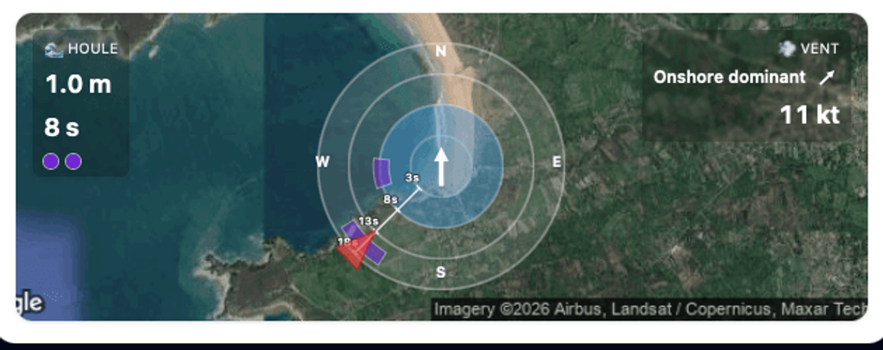

Three changes compared to the old radar, visible on this capture:
- Every component is displayed, whatever its height — no more hidden threshold silently dropping a real swell.
- Color encodes each swell's energy (height² × period, the real physical quantity, not just height alone), on a scale from violet (low energy) to red (high energy, a big Breton groundswell). A short swell can carry more energy than a taller but very long one, and vice versa — color makes that visible at a glance.
- The radial axis encodes period: the closer a swell sits to the center, the shorter its period; the further out, the longer.
Component 2 here is a good example for reading this new radar: at 15.97 s, it's a very long swell — it draws far from the center, almost at the edge — but with only 0.14 m and a tiny associated energy, it stays violet, the coldest color on the scale. A long swell isn't necessarily a swell that matters — it all depends on its height, and the radar now shows that explicitly instead of leaving it implied.
That, with some hindsight, explains the gap noticed over those few days of September between what the app announced and what we actually found in the water at Goulien. None of it was visible from the beach — just a hunch that kept coming back too often to be a coincidence.
What's still underestimated
One last point, in all honesty: on a session at 11am on Saturday September 5th, the waves looked head-high — I'd have said 1 m, maybe 1.2 m on the biggest sets. With the same raw data and every adjustment described here, the calculation doesn't go above roughly 0.8 m: wave height plateaus at that level once the direction and period factors are applied, whatever the tuning. It's still underestimated on this specific case, and two open questions remain, unresolved: either an improvement axis still exists — refraction and shoaling of the swell as it approaches the coast, which none of the fixes above model —, or that day's NOAA/WW3 forecast, offshore, simply wasn't precise enough. It will take more field observations to settle between the two, or cross-checking the estimates with real-time readings from the CANDHIS buoy at Pierres Noires, off the Crozon peninsula.
Forecasts for Goulien and the other spots on the Crozon peninsula already include these fixes.
Important information
HappySession provides estimates based on available data and a surf-focused analysis. Actual conditions may differ. Every surfer remains responsible for their own safety and should always be careful.